Making of RAID’s ‘Training’ Video - Color and Composition in Cinematics
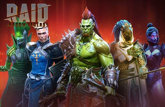
Creating a cinematic for RAID: Shadow Legends takes a lot of work. Great characters and writing isn’t enough: we need to immerse the player in the world of Teleria, which takes a lot of technical know-how and effort.
Plarium’s Concept Art Team Lead, Yurii Ostapchuk, explains how we do it by going over the role of color and composition in cinematics. As an example, he uses our recent cinematic, Training:
The Video Production team was tasked to create a cinematic for RAID: Shadow Legends. The cinematic tells the story of Deathknight, a RAID Champion who strives to become a great warrior. To achieve his goal, Deathknight goes to superior Champions for help.
So, to start off, our team of Environment Artists had to find ways to make the plot work and also properly reflect the story’s mood.
Reference materials and the mood
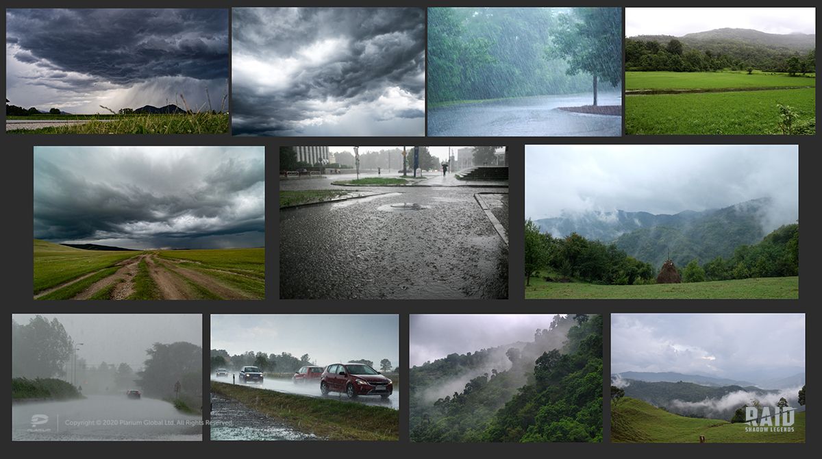
During the brainstorming stages, we decided that the cinematic would feature epic footage like in popular heroic movies. Deathknight would train fiercely, fall in the mud, then get up and continue his struggle. This idea doesn’t leave space for any bright and sunlit scenes.
At the same time, we didn’t want the mood to be depressing. This is why we collected reference materials with various weather conditions.
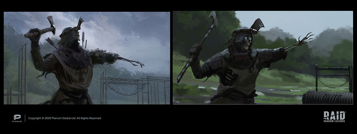
To see how each of these options would look in the cinematic, I prepared five different sketches to help define our color palette.
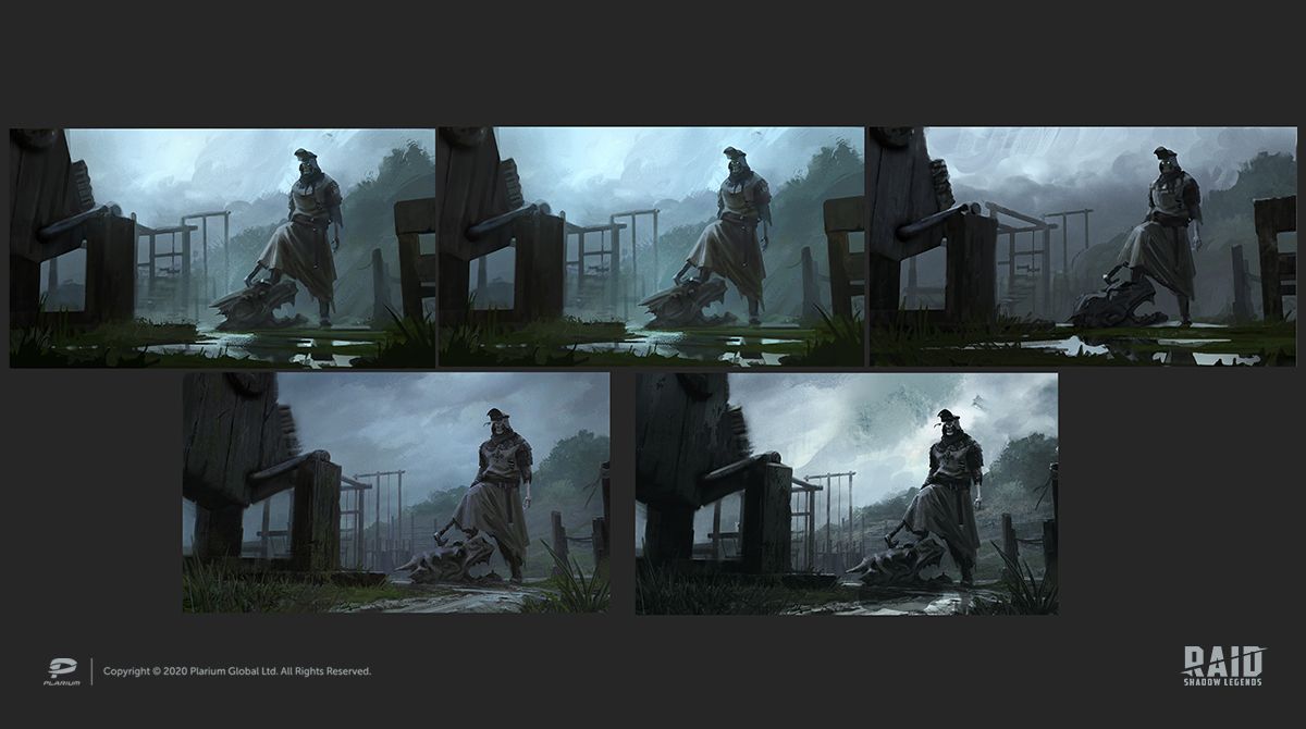
We ended up choosing the second option, the one with local colors and rainy weather. It reflected the mood just how we wanted. The first and fourth options looked too cold and gray. Also, with the second option, we wouldn't have to worry about the extra work with light (as in the fifth) or with heavy rain (as in the third).
The environment
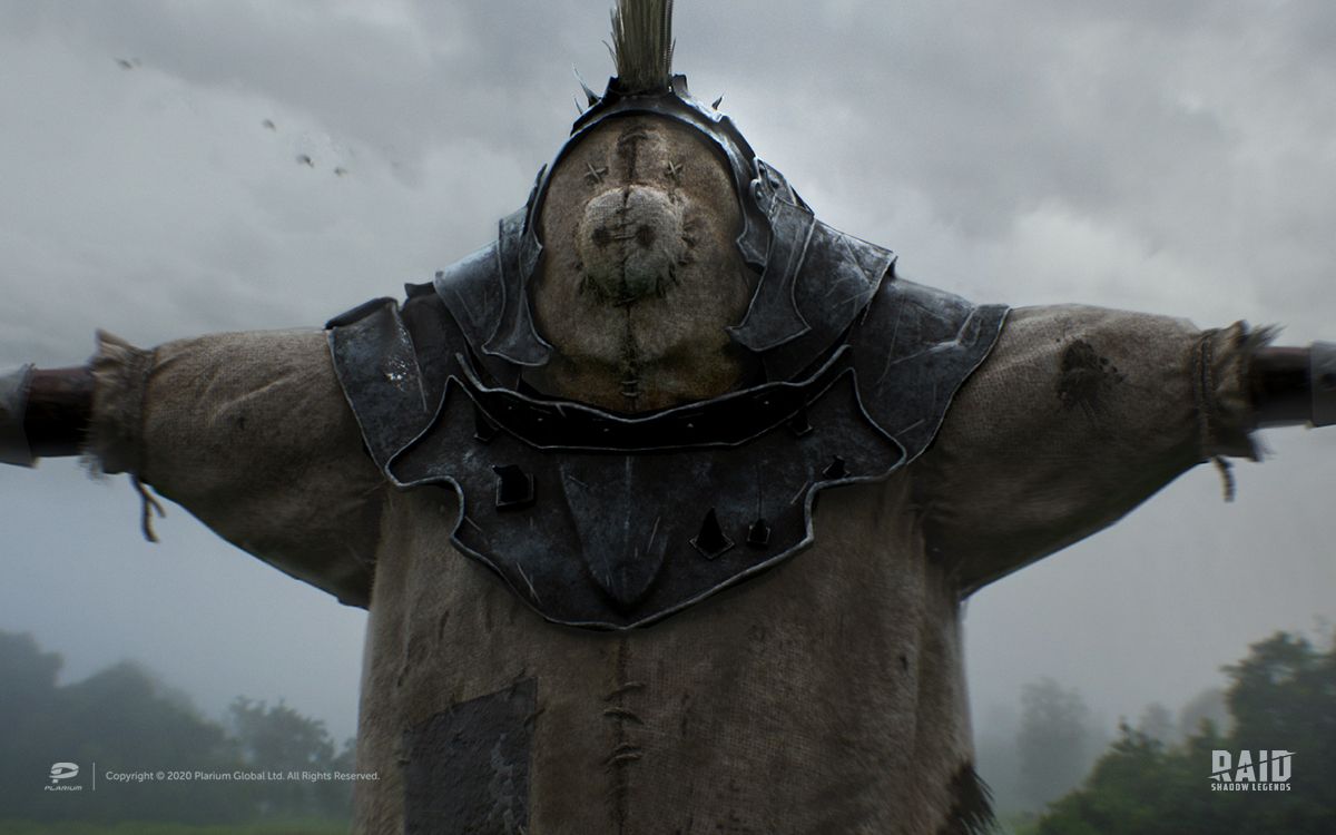
Having agreed upon the weather, we moved on to work with props. To give our training ground an authentic look, we had to pick realistic exercise devices and make sure they matched the game’s setting. As a result, we came up with the wooden dragon and the hog dummy. The latter was a reference to Norog, one of the RAID’s Champions who appeared in previous trailers.
Of all the locations, the castle was the only one we didn’t have to create from scratch. Here’s the article on how we made it.
We had several ideas for the hog dummy, but we decided to go with the first one (the four sketches to the left) as it had the most recognizable shape.
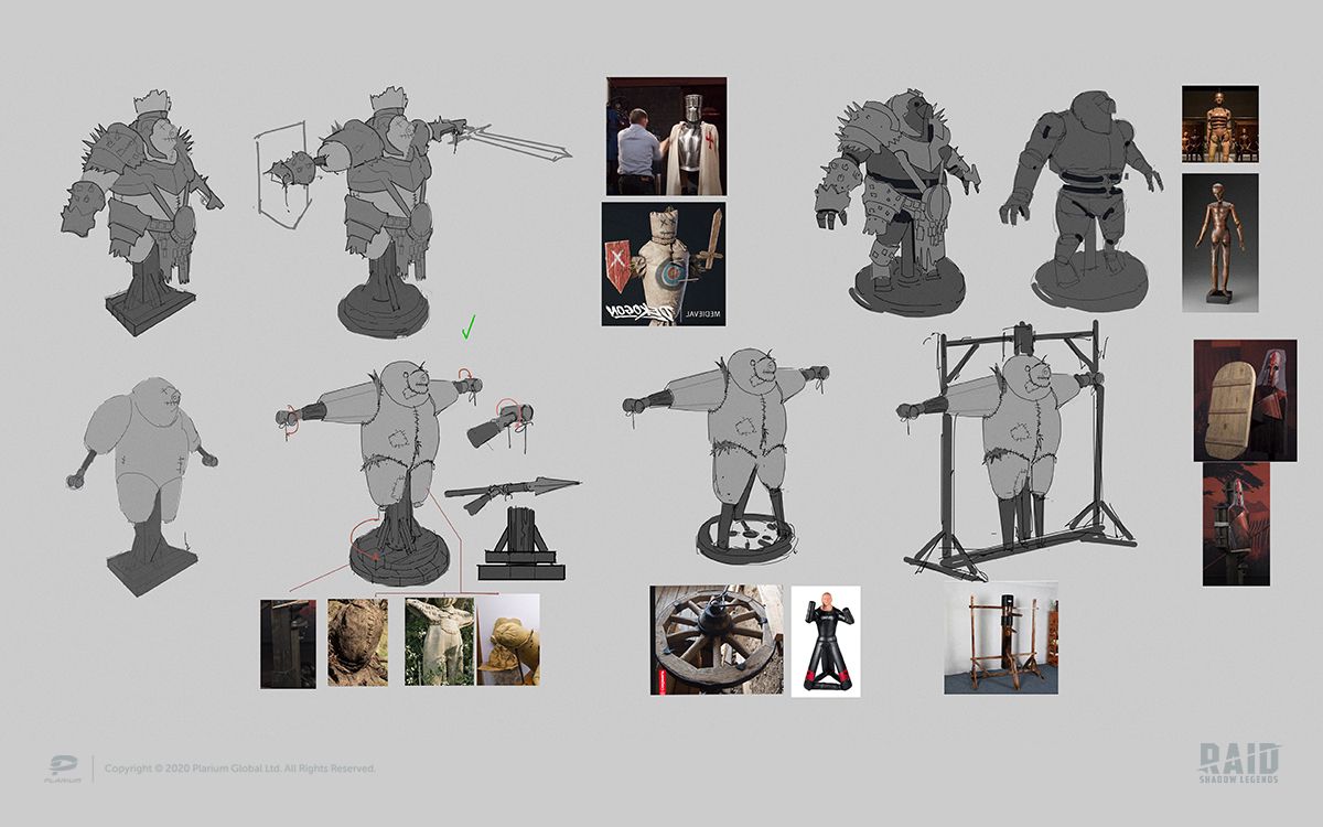
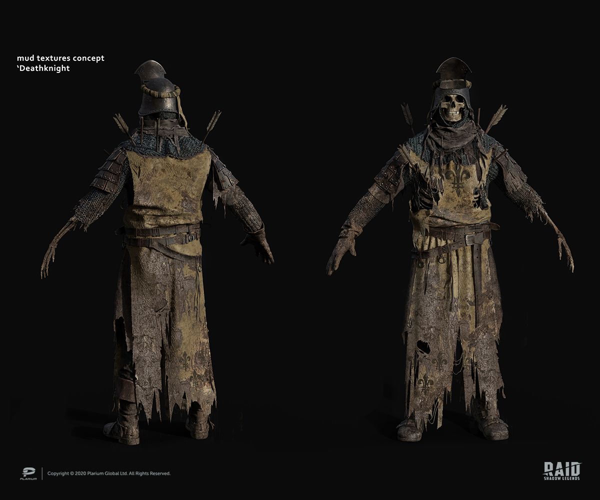
It was essential to give it a worn look. With that in mind, we added scratches, cuts, dents, dirt, and straw.
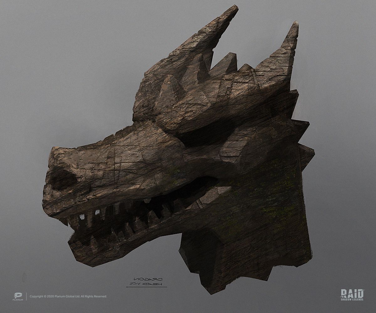
For the wooden dragon reference, I turned to a posable wooden horse figure.
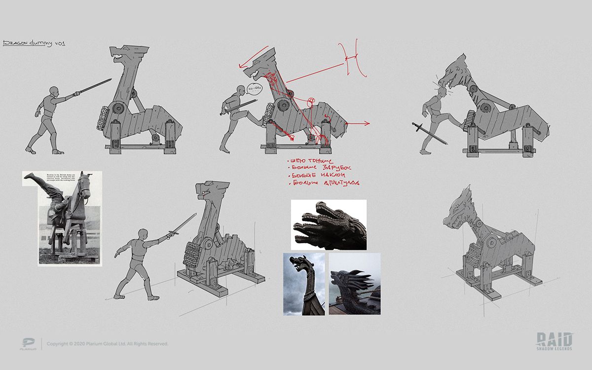
We wanted our dragon head to resemble bows on Viking longships, sometimes known as Drakkars.
It was supposed to have lots of tiny details to emphasize our Champion’s training, just like our hog dummy. This is why we drew sword cuts on it before creating our 3D model.
Characters
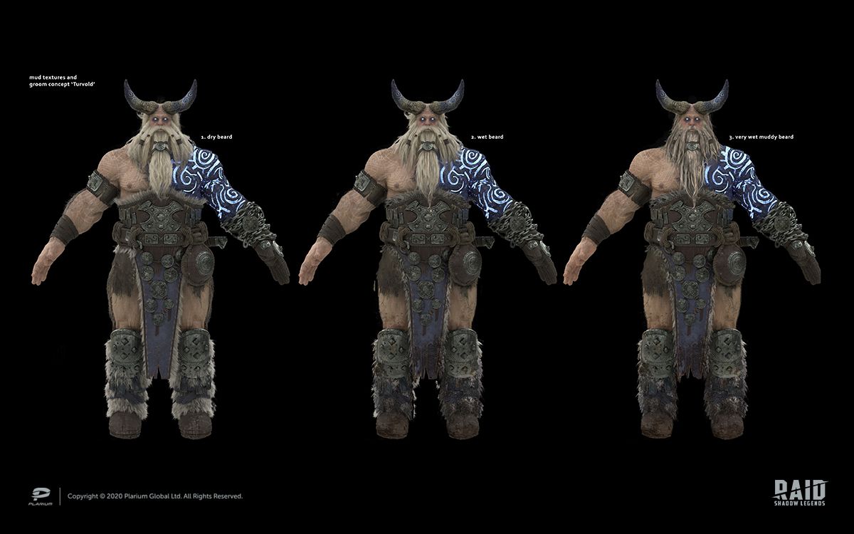
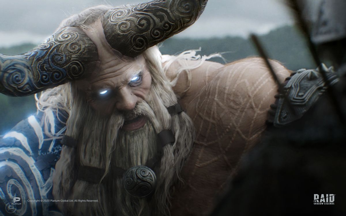
We approached character selection by thinking about the cinematic’s composition. The coach had to be the largest and toughest Champion, while Deathknight had to be the tiniest one. So, we chose Turvold.
We already had all the Champion models; however, we needed to slightly redesign them according to the weather conditions. Since the training takes place outside, we knews the Champions should have wet, dirty clothes. We worked in cooperation with Character Artists to create dirt textures and adjust grooming.
Keyframes
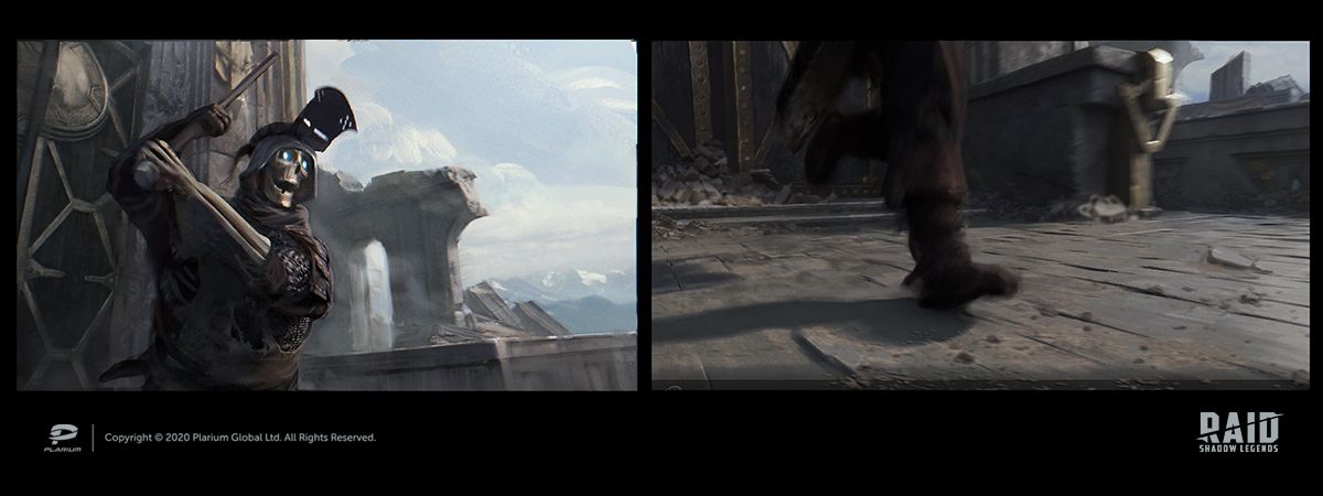
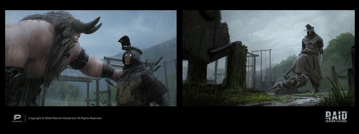
When planning a video, we create keyframes, which are concept illustrations that help us work out color and composition.
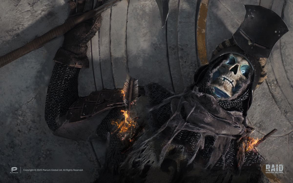
Working on keyframes was a bit challenging for us. The scene is based on ambient diffused light, so we needed to highlight characters without light rims. In addition, we weren’t able to separate elements using fog, because it made it look less realistic. So, to achieve contrast between our characters and the environment, we used local tone and color contrast, showing dark shapes on lighter backgrounds and vice versa.
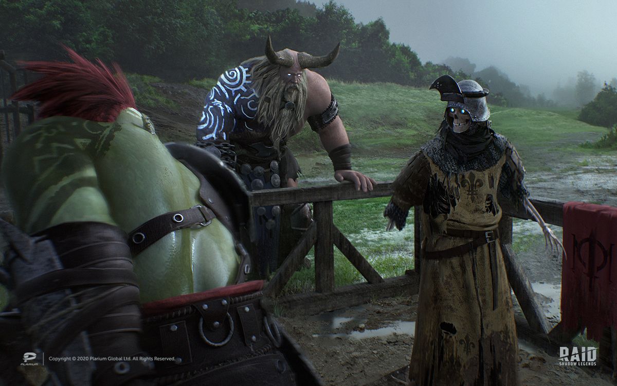
The color script was created based on the tone and color contrast: dark objects on light background, warm ones on cold, red elements on green, etc.
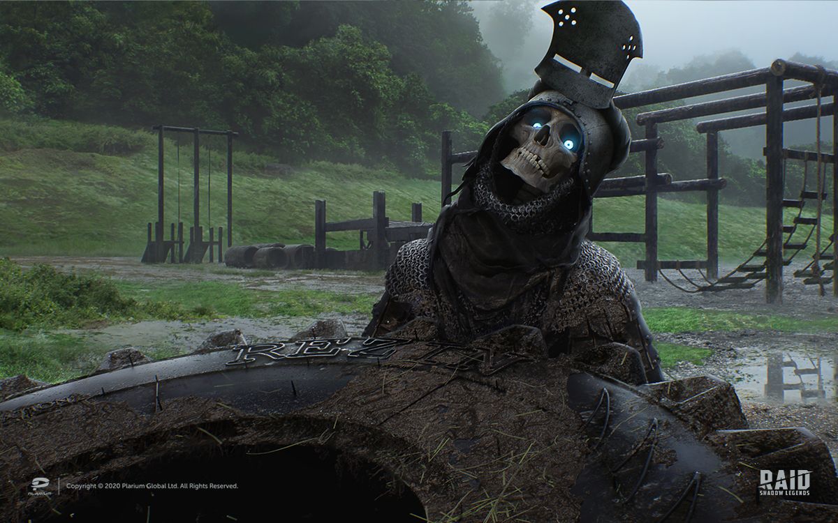
Exercise equipment, mud streams and tree shapes worked as leading lines to Deathknight.
The concentric circles created a sort of visual rhythm, bringing more attention to Deathknight’s face (or skull, rather). This is aided by the use of a gold circle placed close to Deathknight’s bright blue eyes.
Final words
There are lots of aspects affecting color and composition in cinematics: camera position, guides, tone and color balance, accents, etc. Though we had some concerns regarding the cinematic’s mood and atmosphere, the feedback was pretty positive. So remember, your cinematic doesn’t have to use all the conventional and familiar methods to get the user's attention. Instead, you should focus on making sure it has an emotional appeal and an engaging narrative.
Copyright © 2021 Plarium Global Ltd. All rights reserved. You are not permitted to copy, reproduce, or make any use of this article, including any images therein, without Plarium’s written permission.
Author: Yurii Ostapchuk (Plarium Kharkiv)